
Let’s face a fact: designing a smooth, frustration-free login and signup flow is hard. Beyond basic info like name and email, you need user consent for privacy and security, permissions for things like location or push notifications, and maybe a few preferences to personalize the app. All this, without testing the user’s patience. After designing countless flows myself, I still find the process tedious—it eats up valuable user time. But getting it right is essential, as it shapes the user’s first impression of your app. So, how do we create the ideal experience?
Before we proceed to the nitty-gritty, please read the following charter rules carefully. We simply can not proceed if you don’t agree:
The first rule of interaction design is to remove interaction. That means removing any unneccessary clicks, reading or thinking. What does this boil down to in a form like a signup flow? 95% of all users opening a signup form will immediately click into the first field. So save them the trouble and auto-focus on it, meaning: give the inputfield a colored border so it stands out.
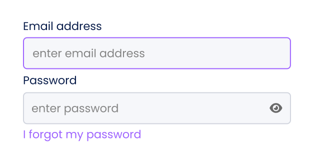
Don’t make users navigate to a new page to sign up when you can embed the form in their current page. If for instance the user wishes to sign up instead of logging in, all she does is either click on the tab ‘signup’ to switch from login to signup or click a text link below the form saying ‘I already have an account’.
Ask the user for an email address instead of a username. Usernames are hard to remember and chances are they’re already taken.
When you’re on mobile, use specialized mobile keyboards. Email addresses always contain a “@”. Mobile phones have specialized email entry keyboards showing those characters, but you need to label your textbox type=email in HTML. It also applies to telephone numbers (type=tel), URLs (type=url), and numbers (type=num).
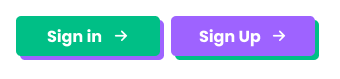
Avoid using similar-looking words for your button labels. The example below makes clear why it could be confusing. You can also experiment with more descriptive or engaging labels, such as “Join the Community” for sign-up or “Welcome Back” for login.
Never, ever hide the inputfields with a keyboard input. It happens far more often than you’d think, so test, test, test.
The classic signup flow is simple: enter your name and email, verify via your inbox, and you’re in. This familiar process feels intuitive when designed well, which builds user trust. But is it secure enough? That depends on the sensitivity of your app’s data.
If your app doesn’t handle highly sensitive information—like personal health or financial data—you might skip immediate email verification and let users access the app right away, with a reminder to verify later. This streamlines the experience, as users prefer minimal disruptions.
However, if your app deals with sensitive data, basic email verification won’t cut it. Consider adding multi-factor authentication (MFA) or monitoring IP addresses. And always use tokenized email links that expire within 15 to 60 minutes to enhance security.
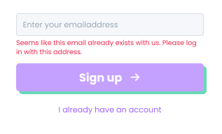
Never reveal whether an email is already registered. It tells potential attackers if an email is valid in the first place, if the user exists within the platform and as such, if they should try to target that account with common passwords or phishing tactics.
Always apply real-time input validation. If for instance the entered email address already exists, show an alert hint.
CAPTCHA is still very much in use, though it’s evolved a lot. It remains one of the go-to defenses against automated abuse, especially on forms like registration, login, and password reset. CAPTCHA’s block things like mass account creation, credential stuffing and brute-force attacks.
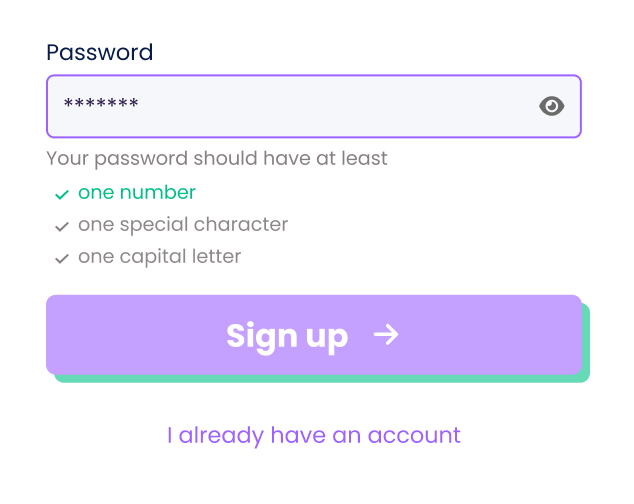
The same goes for passwords. If you want your user to enter a password with different input types to increase password strength (it’s good practice to require this), help her out. Show her the required types as a hint text, checking each box of the desired type as the user enters it. I prefer not using red in this case, as most apps do. Preserve the color red for when things really get wrong. In this case, the user hasn’t done anything wrong yet, except when she has entered a password with one missing input type and then hits the signup button. Only then should it turn red. Also consider showing the required input types only when the inputfield is active (with autofocus)
A secure password benefits from special characters because they increase complexity and make brute-force attacks harder. However, the effectiveness depends on the overall password structure. The best practices are to mix symbols with other elements (e.g. G@laxy23!), avoid common subsitutions (e.g. P@sswOrd), use random placement (e.g. G8*7fGr! instead of Passowrd123!), use more than one symbol and pair symbols with length (e.g. A#34Bv is weaker than A#34Bvg8y$45Rkl)
When logging in, there should always be a ‘forgot password’ option to recover the password. This opens up an inputfield within the same page (or a modal on top of that page) that lets the user confirm or enter her email address. If the user has already entered her emailaddress before realizing she forgot her password, then re-use that email address. It’s good practice to repeat the required input types (see above) so the user has a hint for possible recovering the password on her own.
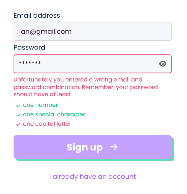
When your user wants to reset the password through a native mobile app, it is generally best practice to send an password reset link through email. When the user clicks on this link, the most seamless option is to deep link it back to the app where the user resets password, allowing the user back in the app. If not, you could also reroute the user to a web page to reset password, but this generally requires the user to manually log in to the app afterwards, resulting in a much more broken user experience.
When logging in, allow users to display the password. You’ll use the eye toggle icon in the inputfield to reveal/hide it. It goes without saying that the password should be hidden by default.
On an extra note, you could also consider not asking the user for a password. There are authentication services like miQey that only ask the user her telephone number and then send her an sms to log her in securely. If you work with sms codes, don’t forget to work with time limits to prevent old emails from being eternally valid credentials.
You can allow users to access the app without requiring them to sign up initially, gradually engaging them as they explore. Typically, you let users interact just enough to get them committed, then prompt for account credentials when they feel inclined (‘to add your first list, please sign up’). This method is known as progressive onboarding or lazy signup and prioritizes retention over acquisition. It emphasizes user experience over collecting user data, even though it limits personalization options. To prevent users from losing any potential data before signing up, consider using temporary and anonymous cookie or ID sessions.
Instead of asking the user to signup using an email address, start with providing her the option to sign up with a social media profile like Google or Facebook. Nearly 80% of all users prefer this and nearly 90% are frustrated with having to create new accounts. Furthemore, using single sign-ons (SSO) raises conversion with over 20%. If you need more convincing on the data, read how well it served UXSniff. However, keep in mind that social logins can raise privacy concerns while offering limited user control over their data. How you show it is up to you, but I’d place the SSO options first, using labelled buttons, and the email option second.
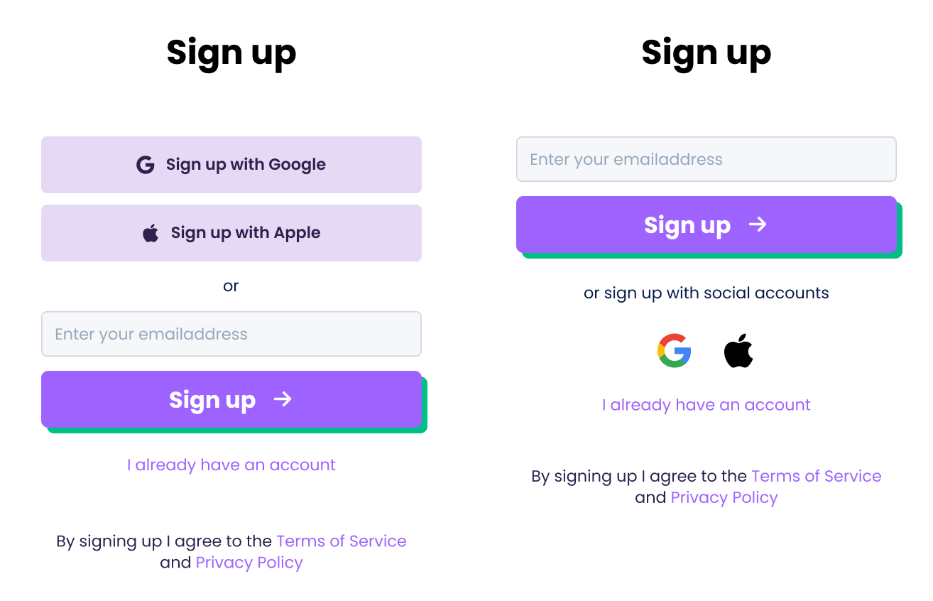
Consider using a different microcopy for your signup button. Dataset replaced the regular ‘Sign Up’ with ‘Try it for free’, which helped increase clicks by 212%.

Logging in a user should ideally be as smooth as possible. Most users will allow password managers or keychains to remember their password. I won’t get into the need to provide extra security layers like 2-step verification as it opens another can of worms. Personally, when the app holds little personal data that can harm the user in any serious way when compromised, I wouldn’t opt for a 2-step verification flow, but since everybody regards his or her data in their own way, I’ll let the decision rest entirely on the app builder’s choice. In any case I would choose to use 2-step verification sent through the mobile phone number by sms. Using an app authenticator like Microsoft or Google Authenticator adds an additional friction point when the app isn’t properly aligned or connected. It happens far more than you’d expect.
While it may not be advisable to keep users always logged in, you can offer to remember their username. This speeds up the login process without compromising security.
A better, more user-friendly option is to let the user stay logged in.
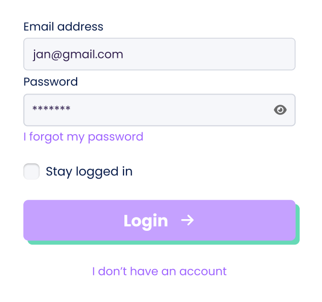
It happens to all of us. Great tip though: get yourself a password manager that maanges all the passwords for you. I have used Dashlane and Nordpass and they both offer great value for money.
When a user clicks on ‘Forgot password’, she will be sent to a modal asking her to enter her email address. If she has already entered it in a previous step, it’s good practice to bring it up again, so she doesn’t have to fill it in twice.
To help protect user privacy and prevent unauthorized access, it’s best practice to use a generic alert that doesn’t confirm whether an email address exists in our system. For example: ‘If this email is registered with us, we’ve sent a password reset link. Please check your inbox. If you don’t receive an email, please contact our administrator for assistance.’
Logging users out of all existing sessions after a password reset is a best practice, especially for security-focused apps (like banking, healthcare, or enterprise apps). Here’s a breakdown of why and how:
It’s also good UX to inform users of this action after they log in again, such as: “For your security, we’ve signed you out of all other sessions after your password was reset.” This reassures the user and avoids confusion if they notice they’re logged out elsewhere.
Requesting a user to sign up implies she recognizes the added value in doing so; otherwise, she won’t sign up. Ideally, users should have some experience with the app before being prompted to register. Therefore, the signup process should occur only when necessary and include only the essential information needed to get started.
Start with asking her email address. It’s where the account will be known with. Ideally it should be the only thing you ask (removing the friction of asking too much from her) and if your technology is smart enough it might even capture name and company from it, which it can then fill in as a smart default for later usage.
A lot of companies require more info from the user to create an account though. Personal details like name, telephone number and company. I’d suggest to keep this for a later stage, and help the user onboard as quickly as possible. If you do need it, ask her once she has entered the app, as a means of form with extra needed details.
To be correct, you need to inform the user how you will store her preferences and what your terms of service and privacy policy is. Not only is it tedious to ask the user to get into that, 85% of users just skip it.
The most used option is to let the user silently agree to the privacy policy when signing up, allowing her the possibility to read them of course. You could also ask the user to check this term using a checkbox, but it’s another violation of friction minimalization.
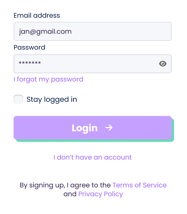
When the user has entered the app, the privacy policy should still be accessible. Mostly this is done in the settings or an about page.
Once your user gets through the flow, she’ll need to land on a welcome page. It’s like getting through customs at the airport. Once you leave the airport and enter the new country, you should feel welcome. So make her feel welcome, tell her what she can expect, apply a bright image with light copy, user a little humor if necessary.

There’s no single “best” login or registration flow for every SaaS-product. The sweet spot balances speed, security, and data needs — tailored to your users. If you’re unsure, start with a familiar flow and gradually experiment. And remember: the only bad login flow is the one that sends users running… before they’ve even tried your amazing SaaS!
Now go forth and let your users in—securely, and with as few headaches as possible

Laatst bijgewerkt: 07/09/2026
Superflow, Borluutlaan 25, 9840 De Pinte — BE0671.842.091 — is verwerkingsverantwoordelijke voor cookies op deze website.
Vragen over ons cookiegebruik, of je toestemming intrekken? Mail naar hello@superflow.design (t.a.v. Data Protection Officer) of schrijf naar Borluutlaan 25, 9840 De Pinte.
Kleine bestandjes die een website in je browser opslaat om je voorkeuren of gedrag te onthouden bij een volgend bezoek — bijvoorbeeld je taalkeuze.
Bevat een cookie gegevens waarmee je identificeerbaar bent, dan geldt onze Privacy Policy ook daarvoor.
Bij je eerste bezoek vraagt een pop-up je toestemming per categorie. Je kan die toestemming altijd intrekken of aanpassen via je browserinstellingen — met uitzondering van strikt noodzakelijke cookies, die essentieel blijven voor een werkende site. Cookies uitschakelen kan je ervaring beperken.
Instructies per browser:
We kunnen dit beleid aanpassen. De meest actuele versie staat altijd op onze website.
Superflow, Borluutlaan 25, 9840 De Pinte — BE0671.842.091 — is verwerkingsverantwoordelijke voor de persoonsgegevens die we verzamelen via deze website.
Vragen, opmerkingen of een verzoek tot uitoefening van je rechten? Mail naar hello@superflow.design (t.a.v. Data Protection Officer) of schrijf naar Borluutlaan 25, 9840 De Pinte.
Voor privacy-praktijken rond onze dienstverlening zelf: zie de overeenkomst die je met ons afsloot, of contacteer je vaste aanspreekpunt.
Contactformulier. Naam, e-mailadres en wat je zelf invult (geen gevoelige gegevens zoals gezondheids- of strafrechtelijke informatie, of rekeningnummers). We gebruiken dit om te antwoorden op je vraag en, met je toestemming, om je onze nieuwsbrief te sturen.
Sollicitaties. Je gegevens gebruiken we om je op de hoogte te houden van je sollicitatie, en — als er geen passende functie is — om je gegevens tot 5 jaar in een wervingsreserve te bewaren, tenzij je je daartegen verzet.
Gebruiksgegevens. IP-adres, apparaattype, browser, taal, geografische locatie en bezoekgedrag op de site. Dit helpt ons de site te beveiligen, beschikbaar te houden en te verbeteren. Geanonimiseerde data valt buiten deze policy.
Standaard bewaren we persoonsgegevens maximaal 1 jaar, tenzij:
Trek je je toestemming in of maak je bezwaar? Dan verwijderen we je gegevens, behalve wat nodig is om die keuze zelf te blijven respecteren.
Je kan altijd:
We reageren op elk verzoek binnen 1 maand, en laten je weten als we die termijn moeten verlengen of niet kunnen ingaan op je vraag.
We werken met externe dienstverleners om de website te laten draaien:
- Combell NV voor hosting
- Fluent Forms Pro voor formulierverwerking
Zijn we wettelijk verplicht om gegevens te delen, of nodig om iemands vitale belangen te beschermen? Dan doen we dat. Buiten dat delen we nooit gegevens met derden zonder je medeweten. Onze site linkt naar LinkedIn — klik je door, dan gelden hun eigen privacyregels.
Waar mogelijk verwerken we gegevens binnen de Europese Economische Ruimte. Gebruiken we een tool die buiten de EER host (bv. Amerikaanse cloudproviders), dan zorgen we voor passende waarborgen zoals modelcontractbepalingen (Standard Contractual Clauses).
Zie onze cookie policy voor details.
We kunnen deze policy aanpassen. De meest recente versie staat altijd op de website.